


Unlocking the Secrets of B2B SaaS Onboarding: A Deep Dive into 40 Leading Products
Elevate Your Onboarding Strategy with Insights from Top B2B SaaS Products.

In the dynamic world of B2B SaaS, onboarding is your first impression – make it count.
As your product refines and markets shift, your onboarding should not be left in the dust. But how can you ensure it remains compelling, even as complexity grows?
There is a universal craving for seamless, intuitive experiences regardless of product differences. But what sets the best apart?
To answer this, I ventured into an in-depth analysis of 40 top-tier B2B SaaS platforms, uncovering the nuances that make their onboarding processes stand out.
This is the first case study of Framing Design.
The motivation behind this case study
When working on our new onboarding with Feedly we have been asking ourselves lots of questions, and we would have loved to get comparison data and insights from the best product out there.
We have transitioned from a Sales Lead Growth (SLG) motion for our Enterprise customers to a Product Lead Growth (PLG). This move is part of a bigger positioning initiative that’s currently ongoing to better elevate our, now mature, Enterprise products.
Looking only at our current data and previous experiences felt limiting, especially when stakes are high with 5-figure clients signing up every week.
By drawing insights from top-notch products, we've not only improved our processes but hope to offer you a valuable resource as well.
Whether you're thinking about revamping your B2B onboarding, eager to catch up on the latest trends, or crafting your first onboarding experience, this case study is for you.
Not quite there yet? Consider saving this article for when you are or pass it along to someone who might benefit.
15 answered questions
Acquisition
What’s the average number of steps during sign-up?
What’s the average range of clicks to get onboarded?
What’s the most commonly used CTA?
What are the most used sign-up options?
Is a work email required?
What’s the most common first step after sign-up?
Which delighter are part of the onboarding?
What’s the last step before the product access?
Activation
What’s the most used tactic for learning
What’s the first thing you’re learning?
What does the paywall look like?
Finding patterns
Even though successful patterns can help you avoid the same mistakes that previous companies have made, you must find your path and secret sauce.
40 audited products

More than 640 screenshots have been made for this case study. Figma file available at the end.
Good first impression demands excellence
Every year, standards increase from the user’s perspective to make a good first impression. Progress bars, single action per screen, and other steppers have become standards for several years now for any onboarding.
Out of the 37 audited products (3 being gated SLG), the number of steps, and clicks to get onboarded testifies it as standard.

A median of 7 steps to get onboarded
A median of 16 clicks to get onboarded
A median of 2 clicks per screens
Your experience might require a longer funnel or more steps. Just keep in mind that this is how users expect your product to work.
Feel free to check out your onboarding in comparison and see where you land.
Rising Frames for 2024: Revolutionizing Onboarding with AI
The future of B2B SaaS onboarding is being reshaped by Artificial Intelligence. In 2024, we anticipate a significant shift towards AI-driven experiences, streamlining the journey from prospect to proficient user. This evolution is not just about reducing steps but enriching the onboarding experience with intelligent, user-centric interactions.
I observed groundbreaking implementations across various platforms. Out of the 40 audited companies, 3 already released some major changes with it.
Framer’s Start with AI


Framer leverages AI to bypass traditional onboarding steps, directly immersing users in the creative process. This approach significantly reduces time to value, demonstrating AI’s potential to transform initial user interactions.
Typeform’s Create with AI

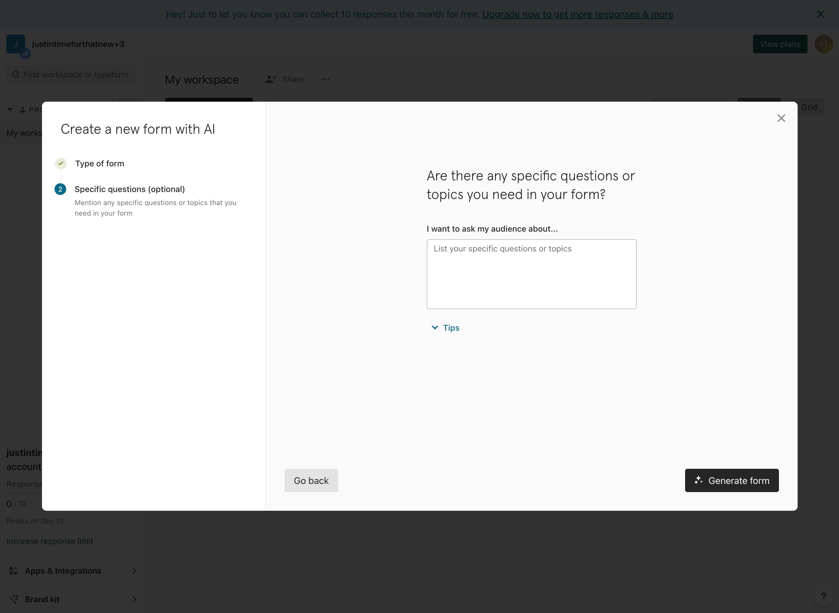


Typeform's AI integration, though less pronounced, offers an alternative perspective. It uses AI as a secondary option, guiding users in form creation, thereby subtly enhancing the onboarding experience.
Pitch’s start with AI
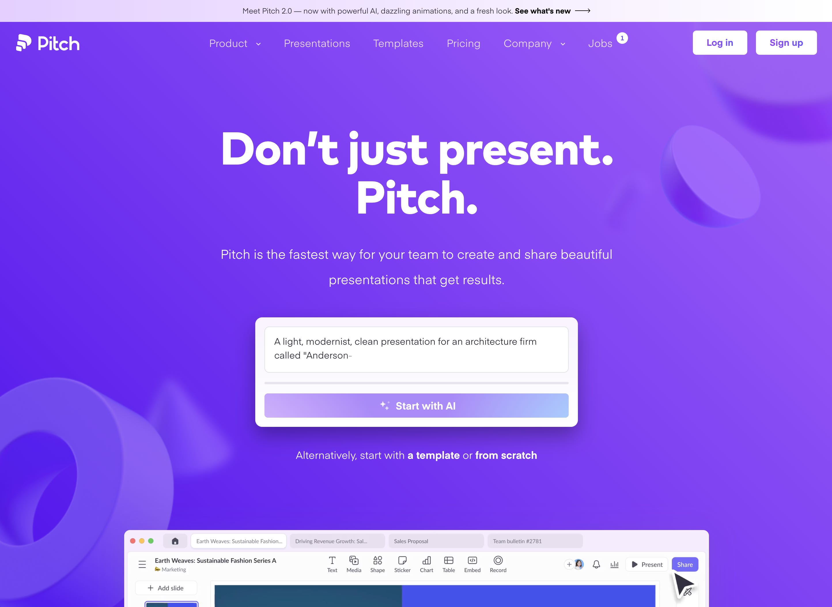

Pitch presents AI as a magical element in its onboarding flow. It customizes presentations with minimal user input, showcasing how AI can personalize and expedite the onboarding process.
Half of the onboarding steps have been moved to a later time, shortening also drastically the time and effort to value to get started with Pitch.
Each of these examples highlights a unique facet of AI's role in onboarding: from simplifying processes to personalizing experiences.
Pros & Cons to start with AI in onboarding
Pros: AI serves as a powerful tool for innovative product marketing, enhances user motivation, and significantly shortens the time to value.
Cons: It requires well-thought-out templates and prompts, with a risk of delivering results that may not always meet user expectations.
As we look towards 2024, integrating AI in onboarding will become not just a trend but a standard for those leading in the SaaS space. Such integration promises not only efficiency but also a more intuitive and engaging user experience. As you consider these insights, reflect on how AI can transform your product's onboarding journey, setting a new benchmark for user engagement and satisfaction.
Optimizing Prospect Qualification in SaaS onboarding
Effective prospect qualification is a delicate balance in B2B SaaS onboarding. The goal is to gather essential information without adding undue friction. Let's explore how leading SaaS products cleverly navigate this challenge.
Is work email required?
43% of B2B SaaS products do not display “work email” in their sign-up process.
3% make the work email mandatory.

Here are some interesting patterns found to increase your sign-up with work email conversion, without making it mandatory.
Miro’s approach

Miro enhances user motivation to use work emails by highlighting the benefits of separating work and personal spaces. This subtle nudge aligns with user interests while serving the platform's qualification needs.
Slack’s strategy

Slack initially suggests the use of a work email in a non-intrusive manner.
If ignored, it gently reminds users of the long-term benefits, using color cues to draw attention without hindering progress.
Zendesk’s method

Zendesk takes a more direct approach, informing users about the smooth integration benefits of using a work email. This directness reflects its commitment to professional and streamlined user experiences.
Sprig’s technique

Sprig initially sets clear expectations by prompting for a work email.

If a personal email is entered, it offers a thoughtful moment for users to reconsider, highlighting the advantages of switching to a work email.
These strategies demonstrate varying levels of directness and user engagement, each tailored to the product's unique user base and onboarding goals. From subtle suggestions to direct prompts, they exemplify how SaaS platforms can effectively qualify prospects without sacrificing user experience.
This approach to prospect qualification is not just about gathering data; it's about fostering a professional relationship from the first interaction. As you refine your onboarding process, consider how these insights can be adapted to enhance your user's journey and improve your qualification efficacy.
What is the most commonly used CTA?
While this question may seem trivial. It was interesting to log this information to confirm that the following CTAs are the most widely used in B2B SaaS products.
Start free trial
Get started
Get started for free
Sign up for free

What are the most used sign-up options?
Email (all types)
Google
Apple
Surprisingly, some products also decided to only use email like Sprig, Mailchimp, Github, Clearbit, Zendesk, Segment, Amplitude, and Front.

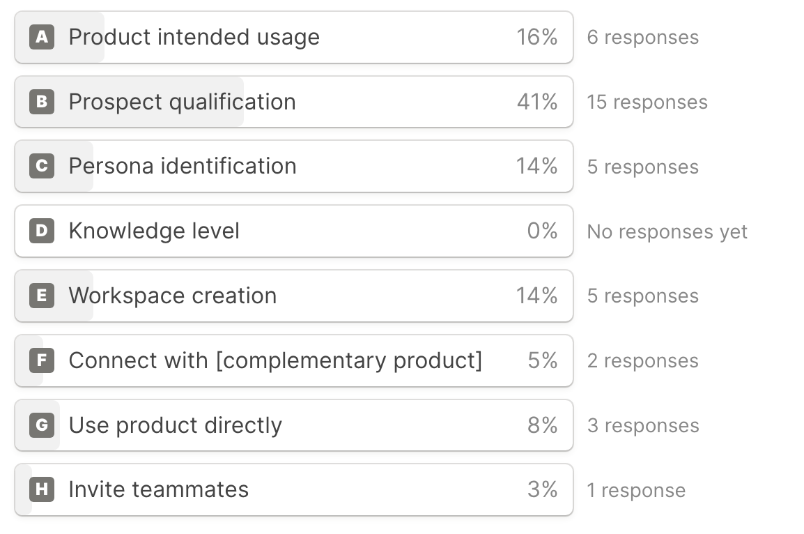
What’s the most common first step after sign-up?
41% of B2B SaaS products placed a prospect qualification screen after sign-up, while only 16% focused on a product's intended usage screen.
Which delighters are part of the onboarding?
Delighters are steps or visual elements that make your onboarding smoother for your users. They can include for example confetti at the end of the funnel, interactive animations, or keyboard shortcuts along the way.
Few companies keep on raising the bar with delights that become easier to pull off like theme selection or interactive animation and may become the norm sooner than later.

46% of the onboarding flows contained at least one delighter. The most commonly used are the interactive animations (30%), followed by a welcome message in 11% of the cases.
What is the last step before the product access?
This answer is more spread out. 19% of the products place a customer qualification screen at the end of the flow, followed by the invite teammate (14%) and the define workspace name (11%).

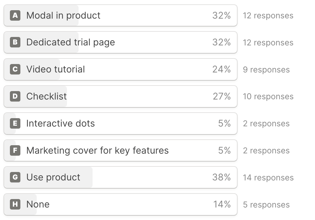
What’s the most used tactic for learning about the product?
Use product directly
Modal inside the product
Dedicated trial page
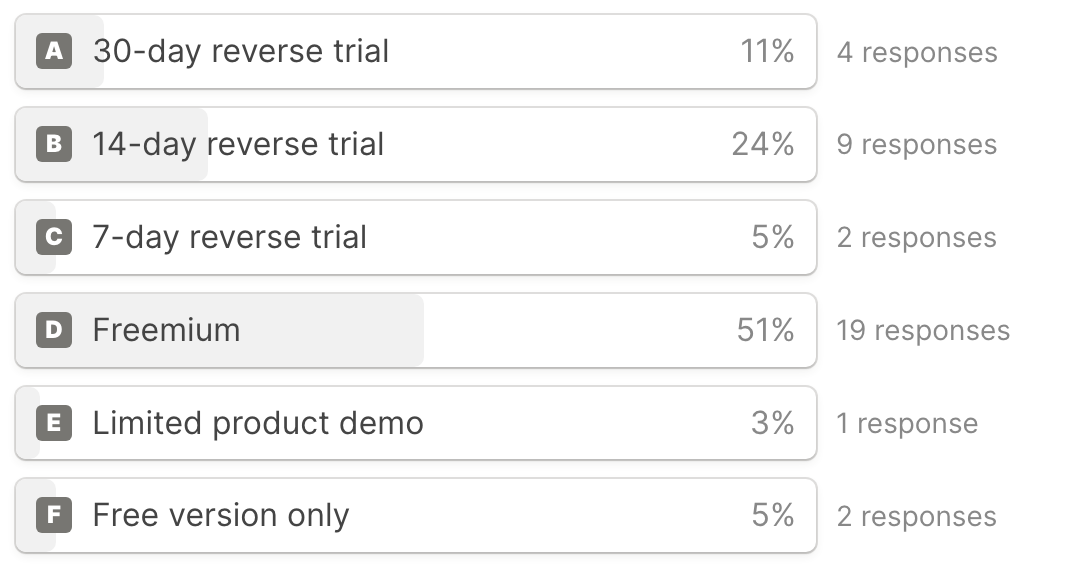
What does the trial look like?
The trial phase is a critical component of SaaS onboarding, serving as the first real interaction a user has with the product. The study reveals that while 14-day and 30-day trials are common, their structure and impact on user engagement vary significantly.
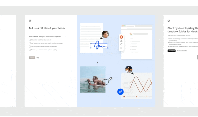
Companies like Sprig and Intercom offer 14-day trials, focusing on high-level product engagement and discovery. These shorter trials often require sales calls to quickly demonstrate additional value and help finalize the setup and convert. In contrast, Asana and Dropbox provide 30-day trials, allowing users more time to explore at their own pace, which can be particularly effective for longer habit-building products.
An intriguing finding is how these companies engage users within Pricings. Some, like Dropbox and Mailchimp, require pricing selection before accessing the product, encouraging direct qualification and potential commitment to the product. Others, like Clearbit and Vercel, give you full access to enterprise features, creating a sense of exclusivity and incentivizing immediate upgrades.

The effectiveness of these trial experiences can often be seen in conversion rates and user feedback. Companies that skillfully balance user exploration with guided learning tend to see higher engagement and conversion, underscoring the importance of a well-structured trial in the onboarding process.
By examining these diverse approaches, it's evident that the trial phase is not just a preview but a pivotal stage in the user journey. Tailoring this experience to your product's complexity and user needs can significantly impact customer acquisition and retention.
Deep dive
There is so much more in those screen flows that will be relevant to your needs. Feel free to dive into the Figma file and Notion database. Both of them are allowed as duplicates.
→ Notion database with all survey results
The Notion database is a treasure trove of organized insights and survey results. Here, you'll find detailed analysis and comparisons of different onboarding strategies. This database is an invaluable customizable tool for anyone looking to benchmark their onboarding process against industry standards or seeking inspiration for innovative approaches.
→ Figma file with all screenshots
The Figma file offers a visual journey through the onboarding experiences of 40 leading SaaS products. With over 640 screenshots, you can explore user interfaces, step-by-step flows, and design elements that make each onboarding experience unique. This visual repository is ideal for designers, product managers, and marketers who want to see real-world examples of effective onboarding tactics and get ideas for their own designs.
Whether you're looking for comprehensive data to inform your strategic decisions or seeking visual inspiration to enhance your product's onboarding experience, these resources are designed to empower your journey. I encourage you to explore them and incorporate these insights into your SaaS products to stay ahead in the ever-evolving landscape of B2B onboarding.
Applying these lessons will position your product at the forefront of user experience in the competitive SaaS landscape.
Product of the month

AIsplash’s landing page
AISplash features free AI-generated stock photos and royalty-free images. Created by the iconic Pablo Stanley.
It's a collection of AI-made photos created and curated by their team, reflecting their artistic view. All images are free to use. It’s unsplash, made by robots, with a human nudge.
Even though this AI-generated feeling can be deal-breaking for your product, I found this positioning quite brilliant.
Thank you for reading
This newsletter is my attempt to create a place where we can learn, share, and grow in our journey of Product, Design, and Entrepreneurship.
Remember, this is your journey as much as it is mine. If at any point you feel this isn't quite what you're looking for, please feel free to opt out–there will be no hard feelings.
This post was the first Case Study – It took a bit longer than usual to consolidate so thank you for your patience - If you have any suggestions on how I can improve the format, just reply to this email with your feedback, and I will personally reply to all emails.
Talk to you next month.
Frame the change.
Micka 🤙
Great case study, Micka! I’m curious about your take on allowing signups with personal emails (e.g., Gmail) for a B2B SaaS. I’ve noticed many users do this to avoid sales outreach, but it can also create friction when converting them into paying customers. How do you see this trade-off?