


Leveraging the 7 layers of design to provide better feedback
Issue #001 – Design feedback & the paradox of user perception

This first post is about something central and critical when it comes to collaborating with designers. Providing meaningful design feedback.
So, what do you think of this design?
We’ve all been in situations where we don’t know how to structure our feedback or focus on subjective aspects. Resulting in poor conversation, time wasted, frustration, and low motivation.
In this issue, we’ll share some advanced tactics to make your design feedback, live or async more productive and impactful.
Introducing the 7 layers of design
Design is about solving problems, user problems. Our design feedback should be the time when we make sure everything works towards that goal. Let’s start defining the first principles behind a design. The different layers.

1. Motion design
The first layer is all about creating fluid, intuitive, and engaging user experiences. Motion Design is about creating attractive animations and effects, easing navigation, and enhancing interactivity.
→ Motion design should be the icing on the cake.
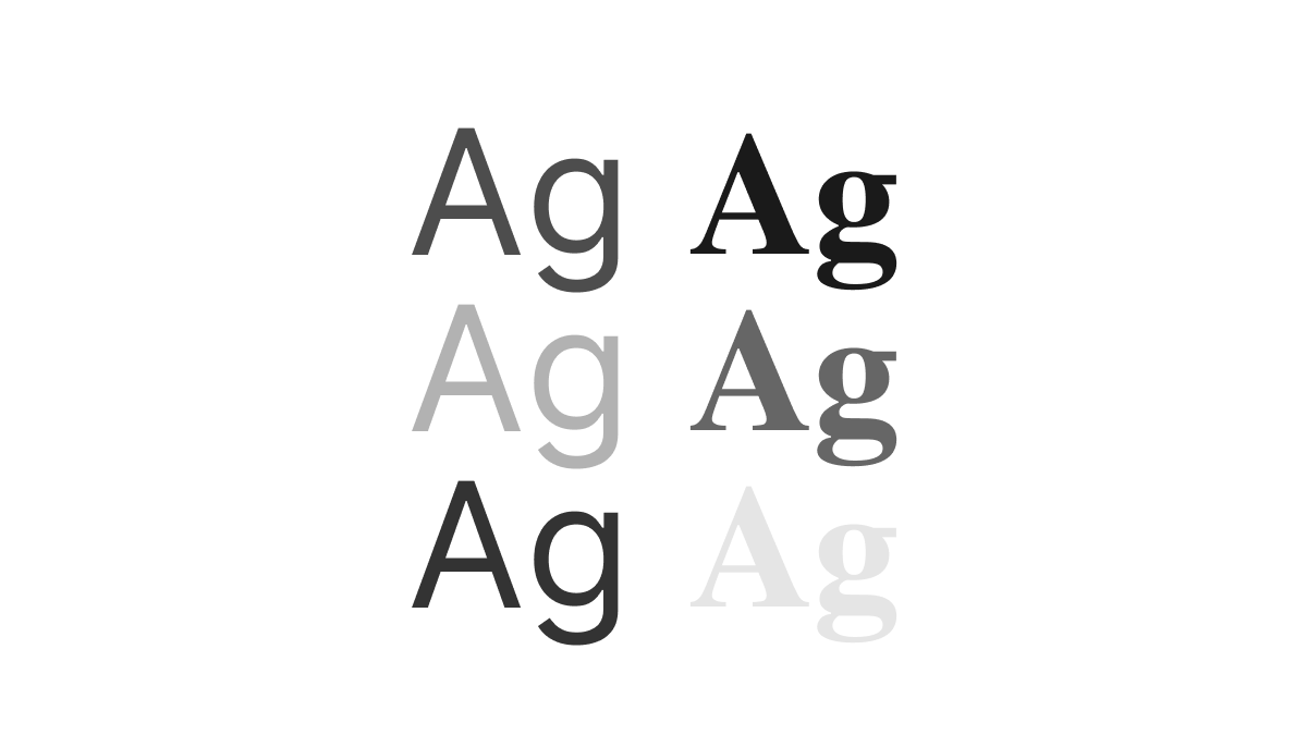
2. Visual design & aesthetics
This aspect encapsulates the general look and feel of the product. It should encapsulate the harmonious balance of color, typography, imagery, and layout coming together to create an appealing and effective visual design. Aesthetics is about creating a visual language that speaks to the users, invoking emotion and enhancing usability, making the product not just usable, but delightful.
→ Visual design is where most of the team focuses on design reviews.
3. Information hierarchy & interactivity
This layer refers to the organization of content on a page to convey importance and flow. Information hierarchy must be designed to effortlessly guide the user's eye and understanding from crucial elements to subsidiary information.
This layer is also the place where interactive components and dynamic content should be discussed.
Finally, this layer should also focus on accessibility, where design ensures that every user, regardless of their abilities, can navigate the products with ease, making them universally inclusive.
→ This layer is often transcribed into wire-framing practice, usually skipped

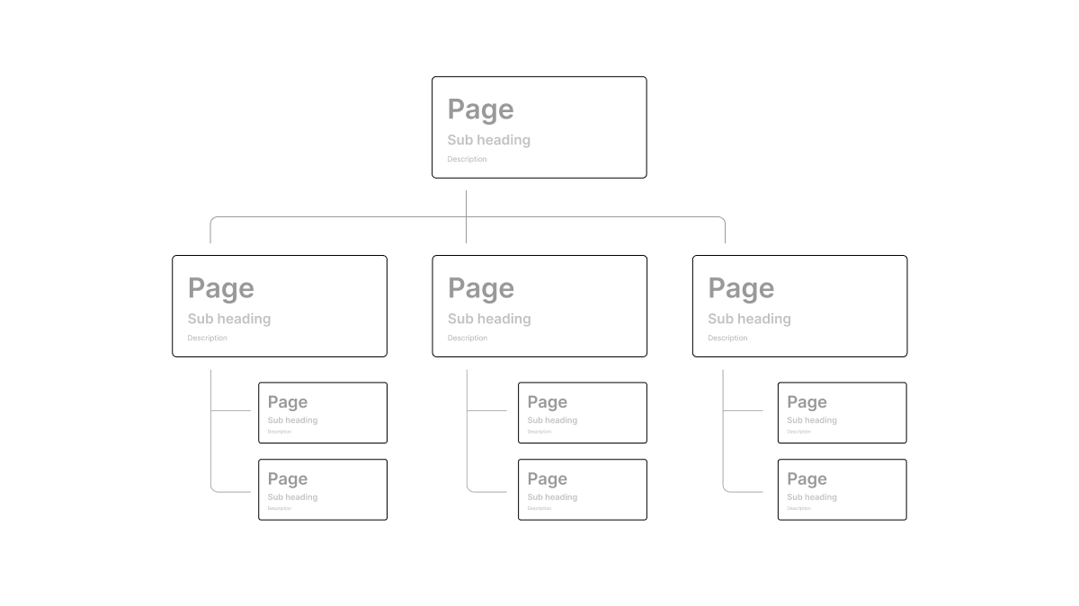
4. User flow & information architecture
This refers to the structural design of shared information across the different pages of your product, with a focus on the arrangement and organization of data. As the backbone of our product, a well-implemented flow or information architecture facilitates effective navigation, fosters seamless interactions, and helps users find exactly what they're looking for.
→ You can think of User flow and information architecture as the architect’s master plan
5. Functional requirements
The goal of this 5th layer is to articulate the fundamental actions that the product must perform. These requirements act as the cornerstone of your design and development process, ensuring that the product meets user expectations from day 1.
→ Functional requirements make sure you have doors, windows, and stairs in your architect’s master plan.

6. User needs & problems to solve
At the heart of any successful product lies user needs and problems to solve. This involves studying, understanding, and empathizing with the users' problems, needs, and wants, and aligning these insights with the design and functionality of your product.
They refer to the practical issues or challenges that a product or service is designed to address. This is often a tangible or logistical problem that users face daily.
For example:
Uber users need efficient, convenient transportation.
Airbnb users seek unique, affordable travel accommodations.
Stripe users require a secure, simple online payment platform.

7. Deep intrinsic motivation
Deep intrinsic motivation refers to the underlying psychological or emotional reasons why a user might choose to use a particular product or service. These motivations often tie into broader life goals, values, or desires, and they can be a powerful driver of user behavior.
For example, the desire for autonomy and control over one's transportation might motivate someone to use Uber or the desire for a unique and personalized travel experience might inspire someone to choose Airbnb over a traditional hotel. Finally, Stripe users will value seamless, secure transactions and the global reach of their business.
By tapping into users' intrinsic motivations—such as mastery, autonomy, or purpose—you’ll create a product experience that's not just useful but intrinsically rewarding. This results in a product that users won't just appreciate, but one they'll love to engage with time and again.

How to use those layers in your next design review
Now that we’ve seen the different layers of a design, how can it help you perform better in a design critique?
Understanding design layers can boost your critique skills. If you're the designer, clearly state which layer needs feedback. If you’re the reviewer, ask where your feedback is most needed and where the design focus has been.
Moving to the early explorations phase? Ensure your foundations are solid, or your designs may stall.
Product teams, start your critique sessions on the less visual layer, then revisit the finer details at the end.
Questions to ask in design review
What layer should we focus on today?
What layer are we working on right now?
Have we achieved sufficient clarity in our foundational layers for our design to excel?
Are there any core questions we need to answer before focusing on the latest design layers?
This layering technique, renowned for its use at Pixar for anime feedback, emphasizes that a great story outweighs special effects. It's applicable across various disciplines, distinguishing concept from structure.
The paradox of user perception
Final users will start by perceiving the product the other way around creating one great paradox that designers should master. The paradox of user perception.
Even though you should start your projects by focusing first on the deep intrinsic motivation in our product, the users, on the other hand, will have an instant judgment of your product in the first seconds of interacting with it.
This effect is especially true when users have very low time commitment or when you’re in a competitive market like consumer apps.

When Product focus
If you’re creating a new product category or looking to find your Product Market Fit (PMF), focusing on the deep layers should be most of your focus.
Providing good foundational design should always meet your user expectations but you probably don’t want to over-invest in it until you’ve stabilized your PMF so that you keep the agility and flexibility your company needs.
When User perception focus
On the other hand, if you’re looking to create another product in an existing market category with established needs and desires, focusing on User perception and design as a strategic differentiator should be where you heavily invest it.
That was the case when neo banks like Revolut or N26 leveraged highly-optimized user flows, interactions, visuals, and motion design to create an immense distinction with their competitors on stable deep intrinsic motivations.
Be focused during design critiques
No matter which type of company you’re currently building or working for, your product and design will need constant improvement. When reviewing design make sure to:
Clarify which layer you’re currently focusing on
Explicit which layer has gaps or would require improvements
Start any projects with deep intrinsic motivations first and move up the layers to finish with the cherry on the cake
By doing so, you’ll be closer to creating products solving deep intrinsic user needs, with clear foundations and providing clear information in an elegant way. This will also ease the conversation internally and enable you to better structure your reviews.
Those layers are one out of multiple frameworks you can leverage during your critiques. I might expand on other frameworks in other posts if you found this one useful.

This part of the newsletter is a place for you to access
the most valuable links I’ve found this month.
Product of the month

Speechify is a Text-to-speech voice reader that finally works. With a truly impressive UX. I’ve started to install it as a Chrome extension and started to assist me when I’m tired of reading over the screens or when my attention is dropping.
I found out that it actually increases my reading speed, and my ability to concentrate and memorize what I’m reading, which has been an impressive add-on to my toolkit.
I’m only 2-weeks in, I don’t use it every time but I find it a comfortable add-on that I can tune in whenever I feel the need.
Actionable links
Explore AI-Driven UI Patterns → Teardowns.ai
Name your Design System components properly → Component.gallery
Great read about experiencing time within our modern calendars, advocating for multi-layer calendars. → julian.digital
Did you learn something new from this post?
Summing Up
This newsletter is my attempt to create a place where we can learn, share and grow in our journey of Design and Entrepreneurship. I’m excited for you to join me on this journey and I thank you for reading.
Remember, this is your journey as much as it is mine. If at any point you feel this isn't quite what you're looking for, please feel free to opt out–there will be no hard feelings.
If you have any suggestions on how I can improve the format, just reply to this email with your feedback, and I will personally reply to all emails.
Talk to you next month.
Frame the change.
Micka 🤙
If you find this post helpful, consider sharing it with a friend using the button below
Très bonne mise en bouche cette première édition, well-done !
Le concept 7 layers of design feedback, ça vient de toi ou c'était un concept déjà existant ? :)